
Paint Trends 2019 (Part 2)
Well, hello there! Towards the end of January I shared this post, where I outlined some paint trend predictions for 2019. Today’s post was supposed to be part two of the predictions, but since we are now in the thick of 2019 (and predictions don’t seem as appropriate anymore) I am sharing some of my favorite Benjamin Moore paints that tie into those paint trend photos I shared back in January. A more appropriate title:
my go-to paints for 2019
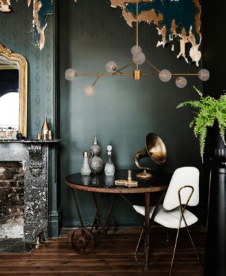
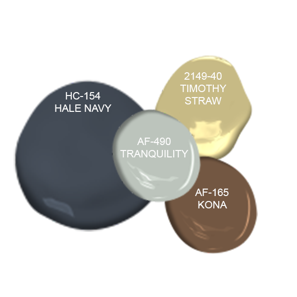
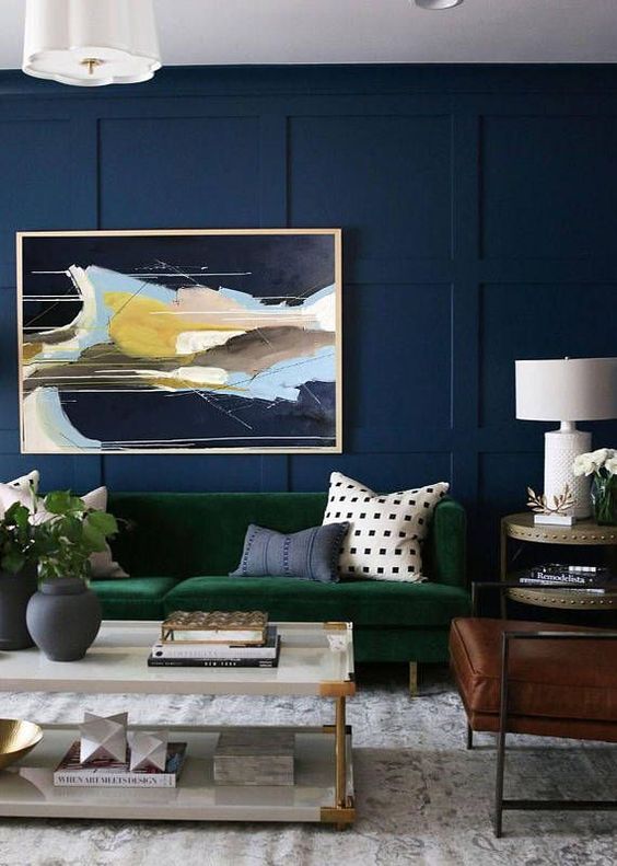
So six weeks later, here it is! For starters, I was predicting that 2019 would be a year where we push our boundaries and embrace color - specifically through moody jewel tones:
MOODY JEWEL TONE PAINT TRENDS
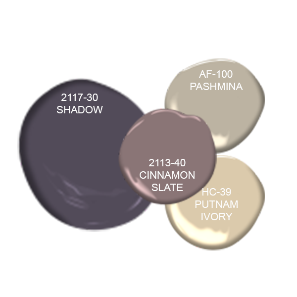
With all of these moody color palettes, I took some cues from the images as to what accent colors would fit nicely with the main, bold color. When looking for accent colors I typically look for a few neutrals that have similar undertones and one complementary color. Please note that this is just one approach to determining the right colors for your space and there are many other strategies to select color schemes for any given space.
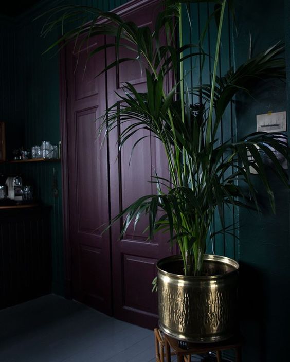
For example with the deep purple -Shadow scheme, I choose Cinnamon Slate and Pashmina as accents because they both had a reddish/warm undertone that tied into the red undertones of the purple paint. Putnam Ivory is the complementary color in this scheme. Think back to your elementary school art classes - this is the color that is opposite on the color wheel. Putnam Ivory has heavy yellow undertones and the warmth of that ties back to the warm undertones as the accents too. I employed a similar logic while generating the rest of these color schemes.
When it comes to choosing color & paint for space, don’t feel like you need to use each of these paints somewhere. These other colors can easily be introduced through accent furnishings throughout the space. If you look back at the Shadow scheme, you may notice the gold planter. This is how that yellow/complementary color was introduced to the space to balance out and enhance the color scheme so it wasn’t monochromatic.
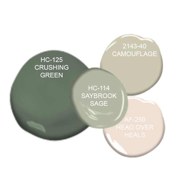
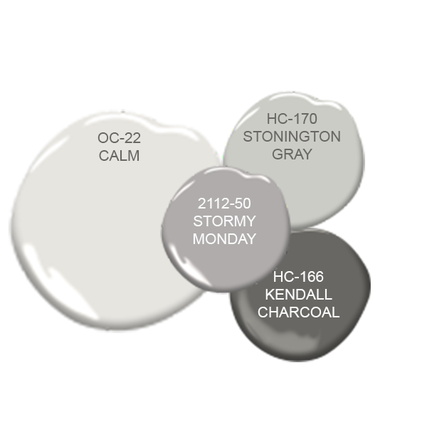
PALE NEUTRAL PAINT TRENDS
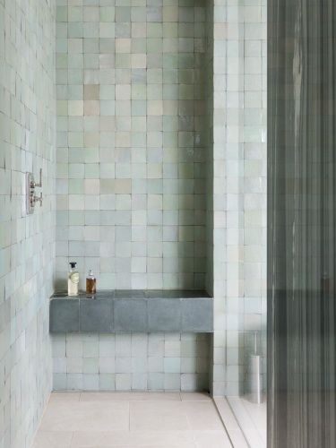
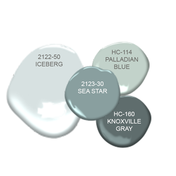
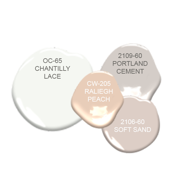
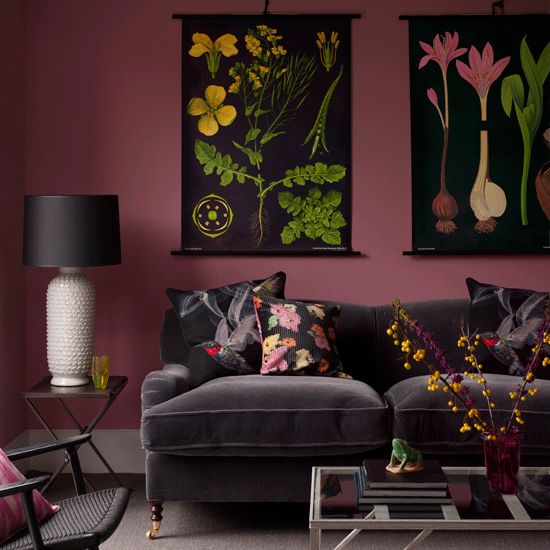
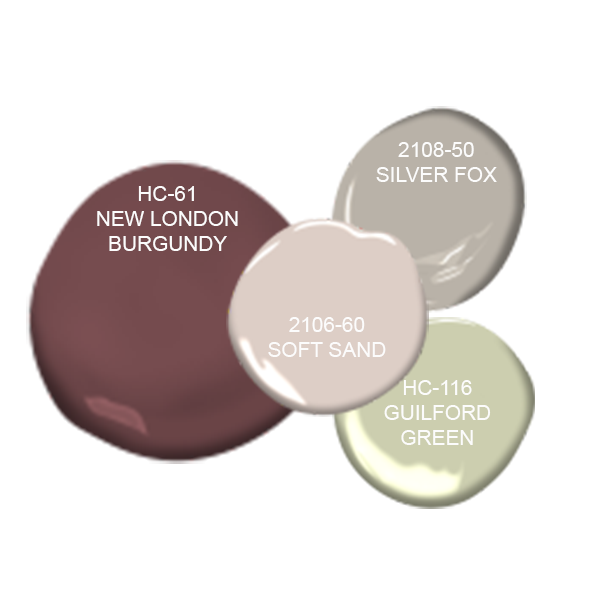
Another paint trend prediction was that we would start to see a lot of pale colors used as neutrals for a space. As I mentioned in my “predictions” post, these colors were going to be much more muted than pastels - which helps them act as neutrals. These are a few color combinations that I generated based off some of the images from the earlier post. You’ll notice that these schemes are much more monochromatic in nature - all sharing the same tones, which is another great approach to developing a color palette for your space.
so what do you think? did you have any favorite color combos?
Let me know in the comments below! Next week, I’ll talk all about the different paint finish options and which one is the right choice for your space. To be the first know when the post is live, sign up with your email at the bottom of this page. You’ll receive a note from me when my next post is up - plus lots of other great design tips and tricks for styling your home!
Ready to transform your space with a little paint?
Book a paint consultation!
Offered as a Virtual Service or In-Person (Philadelphia Area Only)


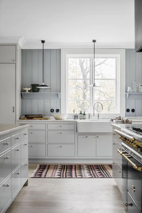
A kitchen renovation designed for real life, balancing generous storage, family-friendly materials, and a layout that works hard without feeling overdesigned.